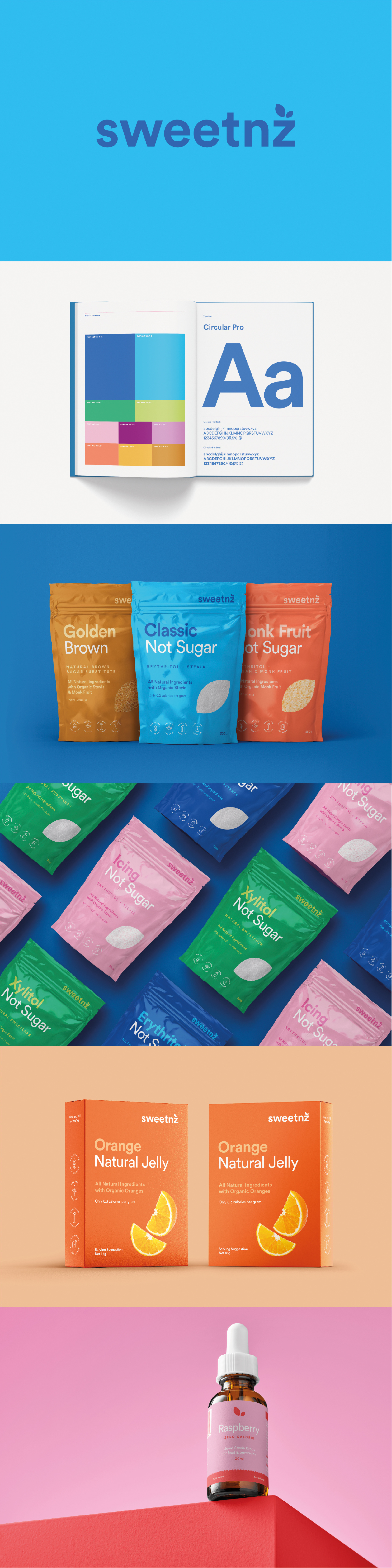
Sweet new look for SweetNZ
Brief
Sugar Free Foods, the company behind SweetNZ, approached SCG to redesign its brand and packaging to drive greater consumer acceptance and market penetration. The project formed part of a wider strategic initiative to elevate brand communications and strengthen presence across both retail and consumer channels. The goal was to create a design system that reflected the brand’s clean, natural positioning while appealing to a broader audience seeking healthy, sugar-free alternatives.
Execution
SCG began the redesign process by refreshing the core visual identity, focusing on an updated colour palette, refined logo, and consistent typography system. The new design language extended seamlessly across the full product range, ensuring visual unity and recognisability on shelf. A key aspect of the revamp was the introduction of simple, intuitive iconography – making product benefits and attributes easy to understand at a glance. This clarity helped enhance shelf impact while communicating trust and transparency to health-conscious consumers. The final look combined simplicity, freshness, and subtle sophistication, creating a cohesive visual identity that works beautifully across multiple product lines and packaging formats.
Outcome
The Sweetnz redesign helped reposition the brand within the health and wellness market. The updated packaging not only achieved a cleaner and more contemporary aesthetic but also improved consumer engagement through on-shelf standout.
Services
- Brand development
- Creative conceptualisation
- Strategy
- Design
Channels
- Packaging
- Labels